Color Us Excited About 3DL
Creating Integrated Design Looks with 3D Laminate
We at Stratis never get tired of talking about 3D laminate (3DL) and its superstar qualities. Besides the fact that we are proud to be among the very elite group in the country that has mastered the 3DL process, we are also continually amazed by its creative uses and potential. As we’ve noted in prior blogs, 3DL really shines because of these benefits:
• A high-end look without the high-end price
• Extremely durable and multifunctional
• Versatile for use among many industries
• Moisture-resistant, high stain resistance, easy-to-clean, and low-maintenance
• No warping, cracking, or splitting
• Seamless, soft edging promotes cleanliness and prevents painful knocks
• Made in the USA
Making the decision to include 3DL in your remodel or new space is easy to do for the reasons mentioned above. But now that you’ve decided, how do you include it seamlessly into your vision? We can help!
Our 3DL Color Collection has more than 49 finish options including Textured, Stone, Authentic, Natural, and Solid. If you are refreshing a current space or creating an entirely new one, the many options available provide ample opportunities for a wide variety of styles and atmospheres, all while retaining durability and strength.
With regards to our 3DL Color Collection, here are design tips and recommendations for incorporating 3DL into your space.
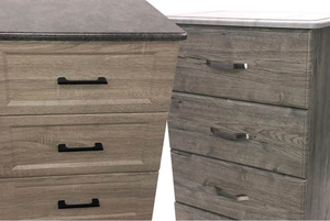
Wood-Look Surfaces - Wood usage for items and surfaces is as old as time and is still a favorite. Stratis’ ultra-realistic 3DL long-grain or reclaimed wood patterns not only cost less, but will never crack, peel, absorb moisture, stains, or bacteria, and doesn’t require costly maintenance.
Mixing Wood Looks
Exactly matching wood looks throughout a room, building, or facility is extremely difficult unless all the components are purchased from the same supplier at the same time. Also, matchy-matchy wood tones or too many matching pieces can look flat. Cohesively matching varying tones can bring a space to life with texture and a layered, comfortable vibe. Here’s how to do it:
1. Identify or Choose the Dominant Wood Tone. This is the wood surface or item that has the strongest presence in an existing space or the main choice for the creation of a new space. The dominant tone is the starting point to ensure cohesion throughout the rest of the design. If the dominant tone already exists and you’re not crazy about it, there are many design options and additions that can be used to soften it out.
2. Determine the Undertones. Wood finishes are classified into Warm (tones of yellow, oranges, and reds), Neutral (usually one yellowy shade with no undertone), and Cool (tones of grey, black, blue, even a bit green – often from stains like charcoal, bark, or sand). Warm undertones are associated with white oak, cherry, maple, mahogany, and hickory. Walnut, cane, blackwood, and birch are usually considered to have a neutral undertone. Cool undertones often refer to ash, maple, poplar, and pine.
3. Complement or Contrast? Whether you decide to choose a complementary or contrasting addition to your space, the rule of thumb is to use warm undertones together or cool undertones together. Mixing the two creates an unsettling atmosphere. One successful formula is mixing a light warm tone + a medium warm tone + a dark warm tone. This adds depth, interest, and balance. For a significant, but working contrast look, only pick two tones like a light cool tone + a dark cool tone. If you try to match tones too close in color, it ends up looking like a mistake.
4. Or Choose a “Bridge” Wood. This is where the neutral undertones come into play. Using the three-tone equation mentioned above, substitute the medium tone for a neutral one to serve as bridge between the light and dark tones. Neutral tones also help to balance out any overly dominant tones. Rustic or reclaimed wood looks are a great choice for this. The overwhelming opinion of designers is to not mix more than three tones in a space.
5. Create Balance. Congregating too much of any one wood tone together, whether surfaces, furniture, or accents, leads to a disproportionate look. Try to break up similar wood styles, if possible, for balance. Another way to accomplish this is to soften the edges, meaning adding a visual plane like rugs or non-wood look surfaces like stone between two closely toned wood items like a table and floor, or counters and cabinets.
6. Repeat. Repetition is the final ingredient in creating cohesion. Repeating each shade a minimum of two times gives a space unity and structure. Note – accents such as picture frames and wooden bowls are included in the repetition count.
Complement Your Wood Look
Choosing colors to complement or harmonize with wood tones in your spaces comes down to preference and the mood you hope to create. Unfortunately, there don’t seem to be any hard, fast rules out there – designers are all over the place with their opinions. But, there are some consistencies and recommendations that seem to make sense. Also, utilizing a color wheel can help with determining color choices. Note – all wood tones go very nicely with white; other, less austere choices work well too like ivory, cream, tan, and taupe.
• Light Wood Finishes – To contrast or highlight lighter wood looks, dark or strong colors of differing intensity are good options. Hues such as brick, rust, eggplant, red, or a very dark gray. For a softer, more harmonious look, try mocha or rosy peach.
• Medium Wood Finishes – For the best contrast of medium wood looks, choose light, muted colors. To enhance its rich, cozy hues, try warm neutral colors such as taupe, mushroom, or khaki.
• Dark Wood Finishes – Light or sunny colors pair best with darker wood looks to prevent reducing the feel of spaciousness. Some of these shades include pale green, powder blue, light gold, and peach. For additional warmth, try yellow or mango. For drama, give dark red a chance, but add in a bridge color like beige to prevent an overwhelming atmosphere.
• Warm Undertones – Golden, orange, and reddish undertones are complemented by other warm tones – golden paired with butter yellow, orange paired with rust or terracotta, and red with wine or burgundy. Other options include soft creams, peach, salmon, or coral. For contrast, orange tones with blue-gray, reddish tones with sage green, and golden tones with soft lilac.
• Cool Undertones – Complementary hues that play nicely with cool undertones are cool shades of blue, teal, light purple, green, and gray. For contrast and added warmth, try soft peach or gold. If the wood tone is light and cool, avoid washing out the space by adding the spice of red, rust, or terracotta. One universally agreed upon opinion is to avoid yellow-ish tones.
Stone Look Surfaces – Stone 3DL, like the real thing, is very durable, but without the high cost. The natural stone-look finishes allow for broad flexibility with furniture and other applications.
• Light Shades – Lighter shades of stone surfaces are usually chosen to open a space and prevent visually shrinking it. These hues are more design-friendly and won’t dim the lighting situation. Pair tan, beige, or off-white with warm accent colors to add a soft touch.
• Dark Shades – Darker shades of stone bring the drama, but also can create a close, cozy feeling, if desired. Take care when pairing with accents and features – finding balance can be a bit trickier than with a light shade. It is also recommended that a review of the lighting situation be included when deciding to use dark stone – lesser lighting scenarios can create a dim, confining atmosphere.
• Undertones – Like wood, stone surfaces have Warm, Neutral, and Cool undertones. Warm undertone grays paired with naturals like wood are very inviting. Cool undertones are modern when contrasted with white. Neutral undertones, often off-whites, grays, and black in warm and cool shades, are the most versatile and play well with most color palettes.
• Tan Stone – Soft shades of mocha brown, warm peach, yellow-gold, taupe, and gray are quite complementary to tan stone surfaces; for contrast, try olive, sage, or gray-green. Tan shades one to two shades lighter or darker than your surface are good for accent colors.
• Black/Gray Stone – Pastels are a particularly nice match; try cream, light gray, powder/baby blue, soft taupe, pale yellow, sand, antique white, coral, or caramel.
• Dark Brown Stone – This array of harmonious colors will spark a variety of moods: champagne, soft gray-green, terracotta, Wedgewood blue, white, tan, soft gray, and yellow-gold.
Neutral Solid Color Surfaces – Almost universal in its applications, solid-colored 3DL neutral surfaces are particularly functional and affordable.
Black
Did you know that black is not considered a color at all? Scientifically, it is the absorption of all other colors. It has been linked to such notable characteristics as mystery, power, sophistication, and drama. It has fallen in and out of favor over the centuries, but has now positively cemented its place in fashion, design, and décor.
• Neutrality – Since black is not color, it becomes an essential neutral that pairs with all other colors. It doesn’t have undertones, so virtually any color can be combined with it (although some looks might be more appealing than others).
• Tempering Tones – Paler and warmer shades will create a more subtle look and soften the intensity of black: periwinkle/blush (soft neutrals), parchment (old world elegance, sophistication), dusty rose (neutral, but warm), terracotta (warm offset), and brown (moody, modern).
• Emphasizing Colors – Equally saturated tones are eye-catching and bold: white (high contrast), navy (intense), emerald green (rich, chic), and yellow (dramatic, but use vibrant shades, not soft).
Grays
A combination of essentially two non-colors (white and black), gray is considered a neutral color across the board. That doesn’t mean the absence of warm and cool nuances and distinctive, observed families – gray, cool gray, and gunmetal gray being the most recognized.
Neutrality – Grays get along great with most colors, but once again it is important to recognize the warm and cool undertones that run through the entire gray spectrum. The versatility of gray makes it all worth it when analyzing the numerous options and levels of neutral you can achieve. Naturally, it works very well with other neutrals like beige, white, and cream.
• Warm Undertones – Warm grays go with warm colors; think complementary reds, oranges, and yellows.
• Cool Undertones – And cool grays go with cool colors. Cool gray undertones tend to skew blue, so harmonious colors are blues, greens, and light purples.
• Pairings – What vibe are you trying to create to accompany your gray surface? Playful combos include brights like purple, red, turquoise, sunshine yellow, vibrant pink, and rich blue. Use all gray hues of the same undertone for a monochromatic look; add black for a bit more depth and drama. A softer, more soothing feeling can be conjured with pale pink or light green.
Light Khaki
Another “color anomaly” is khaki as it does not exist on the traditional color wheel. It is a combination of primary, secondary, and tertiary colors, or in this case, a mix of yellow, brown, and white that falls into the neutral category and is on the warm undertone spectrum. Words like dusty, sandy, natural, light, and soft are used to describe khaki.
• Neutrality – Khaki is very versatile, working well with almost any color and theme. It is known for its grounding nature and subtlety that can be applied to styles from classic to contemporary. It can warm up large spaces with ease.
• Warm Undertones – Most khaki shades tend to fall into the warmer category, but it is still important to keep undertones in mind when working with it. To continue the warm theme, it does pair well with other warm earth tones – a palette consisting of a combination of colors and neutrals including reds, oranges, yellow, greens, and browns.
• Pairings – Khaki is known to combine exceptionally well with greens, blues, and whites. Specific complementary colors include pewter blue, sage, light red, soft grape. Light and medium khaki pair well with denim blue, red, orange, green, black, and blue. For a soothing combination, consider muted slate blues, mint and olive greens, lavender or wisteria, and corals. These pairings give off atmosphere: tan (inviting, natural), chocolate brown (warm energy contrast), olive green (refreshing), and dark blue (formal, nautical).
• Bold – Khaki can also anchor the addition of the bold and unexpected. Deep, vivid, and statement choices include black and white, brick red, cerise, turquoise, dusty pink, midnight blue, and maize. Dramatic wood pairings like deep espresso, black, mahogany, and cherry are on-point.
As industries and techniques continue to evolve with consumer needs, 3D laminate will only grow in its looks and applications. Keep an eye out to see what new developments arise in this exciting field of surface technology and design.
Contact us with your 3DL needs!
